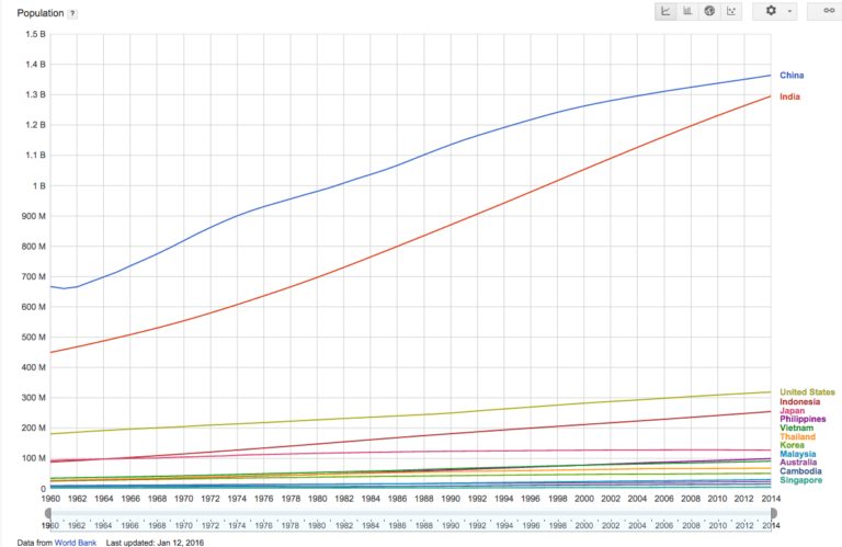
I’m doing some research on China and I’ve really been enjoying Google’s public data app. It’s powerful.
It’s not a stunning, new insight but: When tech is well done it’s ability to simplify complexity and turn disorganized data into interesting, easy-to-see insights is just … magical.
Here is a link in the app to the population graph below.
Here is one just focusing on some of the major Asia / Pacific countries (and link):


